Typography
h1. This is a very
large header.
h2. This is a
large header.
h3. This is a
medium header.
h4. This is a
moderate header.
h5. This is a
small header.
h6. This is a
tiny header.
h1.subheader
h2.subheader
h3.subheader
h4.subheader
h5.subheader
h6.subheader
h1. Small segment header.
h2. Small segment header.
h3. Small segment header.
h4. Small segment header.
h5. Small segment header.
h6. Small segment header.
h6 | This is an h6 with a class of .h1 to alter it stylistically only
h6 | This is an h6 with a class of .h2 to alter it stylistically only
h6 | This is an h6 with a class of .h3 to alter it stylistically only
h6 | This is an h6 with a class of .h4 to alter it stylistically only
h6 | This is an h6 with a class of .h5 to alter it stylistically only
h1 | This is an h1 with a class of .h6 to alter it stylistically only
Fonts
Open Sans
Font Awesome:
1234567890 GNUMICR (UTK)
Lead paragraph
A slightly-larger-than-normal block of text, useful for decks, blurbs, or other descriptive text. Lorem ipsum dolor sit amet, consectetur adipisicing elit. Tempore iusto ipsam, et iste vero facilis.
Normal paragraph
This is a paragraph. Paragraphs are preset with a font size, line height and spacing to match the overall vertical rhythm. To show what a paragraph looks like this needs a little more content so, did you know that there are storms occurring on Jupiter that are larger than the Earth? Pretty cool. Wrap strong around type to make it bold!. You can also use em to italicize your words. You can even use <small></small> tags like so: This is smaller text that inherits its line height
This is another paragraph. Lorem ipsum dolor sit amet, consectetur adipisicing elit. Mollitia maxime eveniet velit. Laboriosam facilis consequuntur praesentium aperiam ratione ducimus, fugiat quibusdam molestias cupiditate, rerum molestiae.
Small paragraph
This is a paragraph with a class of .small-paragraph. It has a smaller font-size and line height, and is a styling class specific to styling small paragraphs. It is separate from the <small> tag, which should inherit its parent's line height. Paragraphs are preset with a font size, line height and spacing to match the overall vertical rhythm. To show what a paragraph looks like this needs a little more content so, did you know that there are storms occurring on Jupiter that are larger than the Earth? Pretty cool. Wrap strong around type to make it bold!. You can also use em to italicize your words.
Subheader paragraph
A subheader paragraph that has a smaller margin top so it sits closer to heading element above and lighter color so it is not as in-your-face. Lorem ipsum dolor sit amet, consectetur adipisicing elit. Nostrum voluptatum rem accusantium tenetur quidem, consequuntur, cum laborum iste magni sed eum pariatur porro reprehenderit. Porro!
Link in paragraph
Links are very standard, and the color is preset to the Foundation primary color.
Unordered list
- List item with a much longer description or more content.
- List item
- List item
- Nested list item
- Nested list item
- Nested list item
- List item
- List item
- List item
Unordered list w/subheader class
- This list has a
.subheaderclass. - List item
- List item
- Nested list item
- Nested list item
- Nested list item
- List item
- List item
- List item
Unstyled List
- List item
- List item
- List item
Inline List
- One
- Two
- Three
Carousels
Buckets
Colors
- $utk-color-primary
- $utk-color-secondary
- $utk-color-tertiary
- $utk-color-info
- $utk-color-success
- $utk-color-warning
- $utk-color-alert
- $utk-color-black
- $utk-color-dark-gray
- $utk-color-med-gray
- $utk-color-light-gray
- $utk-color-white
Buttons
Basic Button Types
Button Sizes
Button Group
Round Buttons
Slide out button
Progress Button
Icon Buttons
Standard
Animated
Position
Mobile Groups
Tables
Table that stacks on mobile
| Cookies | Taste | Calories | Overall |
|---|---|---|---|
| Chocolate Chip | Tastey | 120cal | 7.5/10 |
| Snickerdoodle | Delicious | 95cal | 8/10 |
| Oatmeal Raisin | Superb | 10cal | 11/10 |
| Gluten Free Cookie | Gross | 1cal | 1/10 |
Stacking table within Card
Cooookies
| Chocolate Chip | Tastey | 120cal | 7.5/10 |
| Snickerdoodle | Delicious | 95cal | 8/10 |
| Oatmeal Raisin | Superb | 10cal | 11/10 |
| Gluten Free Cookie | Gross | 1cal | 1/10 |
Forms
Form Groups
Usage
                            <div class="form-group">
                                <label class="required">
                                    First name
                                    <input type="text">
                                </label>
                                <div class="help-text">
                                    <input id="bold-line" type="checkbox">
                                    <label for="bold-line">Bold</label>
                                </div>
                            </div>
                            <ul class="accordion accordion-optional" data-accordion data-allow-all-closed="true">
                                <li class="accordion-item accordion-optional-toggle" data-accordion-item>
                                    <a href="#" class="accordion-optional-link">
                                        <span class="accordion-toggle-text">+ Show</span> optional lines for Second, Third, and Fourth name
                                    </a>
                                    <div data-tab-content class="accordion-optional-content">
                                        <div class="form-group">
                                            <label>
                                                Second name
                                                <input type="text">
                                            </label>
                                            <div class="help-text">
                                                <input id="bold-line" type="checkbox">
                                                <label for="bold-line">Bold</label>
                                            </div>
                                        </div>
                                        <div class="form-group">
                                            <label>
                                                Third name
                                                <input type="text">
                                            </label>
                                        </div>
                                        <div class="form-group">
                                            <label>
                                                Fourth name
                                                <input type="text">
                                            </label>
                                        </div>
                                    </div>
                                </li>
                            </ul>
                            <div class="form-group">
                                <label class="required">
                                    Last name
                                    <input type="text">
                                </label>
                            </div>
Form builder (row grid)
Callouts
Callout
Message Here
Small ButtonCallout for configurator image wrapper
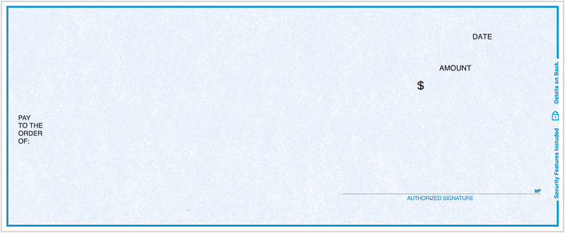
This is a preview image only. Adjustments for layout, sizing, and spacing may be made before printing.
Usage
Modals
Standard Modals
Launch Sign in ModalSign in to your account.
Create a new account.
Pricing Breakdown
| Qty | Price | Total* | |
|---|---|---|---|
| 100 | $1.91 | $191.00 | (Minimum) |
| 200 | $1.71 | $342.00 | |
| 500 | $1.61 | $805.00 | |
| 1000 | $1.51 | $1,510.00 | |
| 2000 | $1.41 | $3,020.00 | |
| 2500 | $1.29 | $3,225.00 | |
| 5000 | $1.21 | $6,050.00 | (Best Value) |
* Total does not include $50 one-time setup fee or shipping costs.